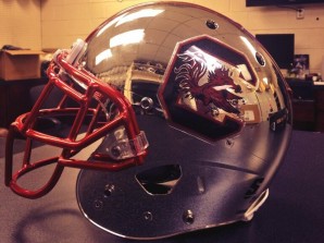
 The University of South Carolina Gamecocks new helmet raises a number of issues. The train has pretty much left the station, I think, in terms of alternate uniforms. Only the most tradition-bound schools are immune to the silliness, though even institutions like Notre Dame and Stanford are tinkering with logos and color schemes and what not!
I suppose the only thing we can hope for is that teams observe a sizable degree of taste and try to preserve as much tradition as possible when–in league with catalysts/enablers like Nike, Under Armor, etc.–they come up with these marketing and recruiting gimmicks. South Carolina, being a school in a conservative and tradition-bound conference but that nonetheless has very little sacred winning heritage to which to be beholden, is certainly fair game for the New Age of College Football Uniforms.
I think that this helmet manages to stay within the bounds of propriety that I tried to establish above. The basic mirrored finish is pretty clean, and I give high marks for the decision to preserve the traditional logo. The tiling and texturing employed by Oregon and TCU are fine, since the former school is the pioneer in uniform silliness and the latter school is an essentially tradition-less upstart. In a conference and state as conservative as that to which South Carolina belongs, it is important to be modest when tweaking the uniforms.
Particularly disastrous cases of wholesale helmet changes that come to mind (screwing with the logo, the color scheme, and the paint finish) would be Arizona State’s flat black with flat yellow pitchfork, Missouri’s flat black with overly-stylized tiger, and of course Maryland’s state-flag-oversized-wrap-job!
Though I’m loathe to say it, sometimes the University of Texas’ uniforms really don’t see so bad…
